
Build an overlay widget
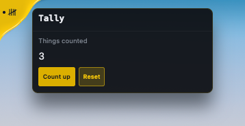
You will build a Tally hub: a button on the overlay that drags, snaps to an edge, opens a panel toward the middle of the screen and closes itself when you move away. You write about 60 lines. The OverlayHubWidget base class supplies the rest.
An overlay widget lives inside a plugin. If you want the plugin side explained step by step, read Build your first plugin first. If you only want a small UI with no TypeScript, use a custom widget instead.
Before you start
Section titled “Before you start”- The TeamHUD repository cloned, with
pnpm installdone andpnpm startworking. See Contribute to TeamHUD. - Ten minutes.
What you get without writing it
Section titled “What you get without writing it”| You get | From |
|---|---|
| Drag, fling and snap to an edge, position saved as a fraction of the screen | OverlayHubWidget |
| Panel opens toward the screen centre and stays fully on screen | OverlayHubWidget and th-hub-panel |
| Hover to reveal, close on pointer-leave, outside click and Escape | OverlayHubWidget |
| Clickable regions registered so clicks outside the widget pass through | OverlayHubWidget |
| Colours, spacing and motion that follow the user’s theme | --th-* tokens |
You write three things: the region id, the hub button, and the panel body. Never write your own drag, placement or collapse code; pnpm check:widget-contract fails the build if you do.
-
Copy the starter.
plugins/widget-hello/is the smallest real overlay widget. Copy it and rename it:Terminal window mkdir plugins/widget-tallycp -R plugins/widget-hello/src plugins/widget-hello/package.json plugins/widget-hello/tsconfig.json plugins/widget-tally/Copy only these three. Don’t copy the whole folder: its
node_modulesholds workspace links, and copying through them fills your disk.Then replace the name everywhere in the copy. Use a find-and-replace across the folder.
Find Replace with widget-hellowidget-tallyWidgetHelloWidgetTallyHello(display text)TallyCheck
package.json:nameis now@teamhud/widget-tally, andteamhud.plugins[0]hasslug: "widget-tally"andmainEntry: "./src/WidgetTallyPlugin.ts". Rename the filesWidgetHelloPlugin.tsandwidget-hello-widget.tsto match. Then runpnpm installonce so the workspace sees the new package. -
Register the bundle. In
src/WidgetTallyPlugin.ts,startup()tells the overlay where your renderer code lives:ComponentBundleRegistry.getInstance().registerBundle({bundleName: 'widget-tally-widget',targetWindows: ['overlay'],federationModule: '/plugins/widget-tally/components',eagerPreload: false,pluginSlug: 'widget-tally',resourceName: 'widget-tally',});resourceNamemust equal thenameininfo().resources, or the on/off switch in Preferences does nothing. -
Mount the element.
src/components/index.tscreates your element when the overlay loads the bundle:import { mountCapableWidget } from '@teamhud/widget-mixins';import type { BundleContext } from '@teamhud/renderer';import './widget-tally-widget.js';let activeWidget: HTMLElement | null = null;export function initialize(context: BundleContext): void {dispose();activeWidget = mountCapableWidget('widget-tally-widget', context);}export function dispose(): void {if (activeWidget) { activeWidget.remove(); activeWidget = null; }} -
Write the widget. Replace
src/components/widget-tally-widget.tswith this. The starter hand-rolls a<button>and marks it; here we use the sharedth-buttoninstead, which a theme can restyle.import { html, css, nothing } from 'lit';import { customElement, state } from 'lit/decorators.js';import { hubOverlayBaseStyles } from '@teamhud/pipeline-primitives/hub-overlay-shell';import { OverlayHubWidget } from '@teamhud/widget-mixins';import '@teamhud/ui-core/components/th-hub-panel.js';import '@teamhud/ui-core/components/th-hub-panel-header.js';import '@teamhud/ui-core/components/th-button.js';const HUB_ID = 'widget-tally';// Inline SVG only: currentColor, a viewBox, no stroke-width. The hub sizes and strokes it.const TALLY_ICON = `<svg xmlns="http://www.w3.org/2000/svg" viewBox="0 0 24 24" fill="none" stroke="currentColor" stroke-linecap="round" stroke-linejoin="round"><path d="M6 5v14M10 5v14M14 5v14M18 5v14M3 17L21 7"/></svg>`;// The mixin's members are erased by the TypeScript mixin cast, so name the ones you use.type OverlayHubHost = {_panelSide: 'right' | 'left' | 'top' | 'bottom';overlayHubMountPointerDown: (e: PointerEvent) => void;overlayHubMountClick: (e: MouseEvent) => void;overlayOpenHubContextMenu: (e: MouseEvent) => void;overlayRenderHubContextMenu: () => unknown;overlayPanelMounted: () => boolean;overlayPanelClosing: () => boolean;overlayHubPanelWidth: () => number;overlayHubPanelHeight: () => number;overlayOnHubPanelResize: (e: Event) => void;overlayOnHubPanelResizeEnd: (e: Event) => void;};@customElement('widget-tally-widget')export class WidgetTallyWidget extends OverlayHubWidget {static override styles = [...hubOverlayBaseStyles,css`:host { position: fixed; z-index: 9998; display: block; user-select: none;font-family: var(--th-font-ui); color: var(--th-text-primary); }.body { display: flex; flex-direction: column; gap: var(--th-space-3); padding: var(--th-space-3); }.label { font-size: var(--th-text-sm); color: var(--th-text-muted); }.count { font-size: var(--th-text-xl); font-variant-numeric: tabular-nums; }.row { display: flex; gap: var(--th-space-2); }`,];@state() private accessor _hovered = false;@state() private accessor _count = 0;protected overlayRegionOwnerId(): string { return HUB_ID; }protected overlayHubRegistryEntry() { return { id: HUB_ID, label: 'Tally', icon: TALLY_ICON }; }protected overlayRefreshHoveredVisual(hovered: boolean): void { this._hovered = hovered; }private hub(): OverlayHubHost { return this as unknown as OverlayHubHost; }override render() {const hx = this.hub();return html`<div id="hub-btn-mount"@pointerdown=${hx.overlayHubMountPointerDown}@click=${hx.overlayHubMountClick}@contextmenu=${hx.overlayOpenHubContextMenu}></div>${hx.overlayPanelMounted() ? this._renderPanel() : nothing}${hx.overlayRenderHubContextMenu()}`;}private _renderPanel() {const hx = this.hub();return html`<th-hub-panel.side=${hx._panelSide}?revealed=${this._hovered}?closing=${hx.overlayPanelClosing()}.panelWidth=${hx.overlayHubPanelWidth()}.panelHeight=${hx.overlayHubPanelHeight()}@th-resize=${hx.overlayOnHubPanelResize}@th-resize-end=${hx.overlayOnHubPanelResizeEnd}><th-hub-panel-header slot="header"><div slot="title">Tally</div></th-hub-panel-header><div class="body"><div class="label">Things counted</div><div class="count">${this._count}</div><div class="row"><th-button size="sm" variant="primary" @click=${() => (this._count += 1)}>Count up</th-button><th-button size="sm" @click=${() => (this._count = 0)}>Reset</th-button></div></div></th-hub-panel>`;}}The panel is
th-hub-panel, never a hand-madediv: that element carries the glass look, the placement and the click regions. If your panel needs an extra popover outside it, overrideoverlayCollectRegions(regions)and push its rectangle. Otherwise leave it alone. -
Wire it into the app. The app loads a hand-maintained list, so adding the package is not enough. Make three edits in
apps/desktop-lite/:// package.json, dependencies"@teamhud/widget-tally": "workspace:*",src/plugin-entries.ts import { WidgetTallyPlugin } from '@teamhud/widget-tally';// inside getEnabledPluginEntries():toPluginEntry(WidgetTallyPlugin),In
src/preload.ts, add"WidgetTallyPlugin"to the plugin-name list that sits beside"WidgetWindowFocusPlugin". -
Build and run.
Terminal window pnpm installpnpm --filter @teamhud/widget-tally buildpnpm --filter @teamhud/desktop-lite build:component-bundlespnpm start -
Test it. Add a lifecycle test next to the plugin, the same way
widget-window-focusdoes. Add"test": "vitest run"toscriptsand"vitest": "^4.1.11"plus"@mythic/resource-registry": "*"todevDependenciesinpackage.json, avitest.config.tswithenvironment: 'node'andinclude: ['src/**/*.test.ts'], then runpnpm install.plugins/widget-tally/src/WidgetTallyPlugin.test.ts import { describe, expect, it, vi } from 'vitest';import { ResourceRegistry } from '@mythic/resource-registry';const registerBundle = vi.fn();vi.mock('@mythic/logging', () => ({ Logger: class { debug() {} info() {} warn() {} error() {} } }));vi.mock('@teamhud/component-bundle-registry', () => ({ComponentBundleRegistry: { getInstance: () => ({ registerBundle }) },}));import { WidgetTallyPlugin } from './WidgetTallyPlugin.js';describe('WidgetTallyPlugin', () => {it('registers its overlay bundle under the resource the toggle controls', async () => {// A plugin needs the app's EventManager; the test supplies a stand-in.if (!ResourceRegistry.get('EventManager')) ResourceRegistry.setValue('EventManager', { emit: vi.fn(), on: vi.fn() });const plugin = new WidgetTallyPlugin();await plugin.startup();const bundle = registerBundle.mock.calls[0][0];expect(bundle.targetWindows).toEqual(['overlay']);expect(plugin.info().resources?.map((r) => r.name)).toContain(bundle.resourceName);});});Terminal window pnpm --filter @teamhud/widget-tally testThis test catches the most common mistake: a
resourceNamethat does not matchresources[].name. To test the element itself,@teamhud/widget-mixins/testingprovidescreateMockWidgetHostContext,createMockCapBridgeandcreateRecordingRegionCaps. See Test and debug for e2e. -
Run the checks.
Terminal window pnpm --filter @teamhud/widget-tally type-checkpnpm check:widget-contractpnpm check:theme-tokenspnpm check:src-artifacts
What you’ll see
Section titled “What you’ll see”A Tally hub appears on the overlay. Click it and the panel opens toward the middle of the screen with a count and two buttons. Drag the hub to another edge and it snaps there; the panel still opens toward the centre. Move the pointer away, click outside, or press Escape and the panel closes. Change your theme in Preferences and the widget changes with it, because it reads only --th-* tokens.
If it goes wrong
Section titled “If it goes wrong”- Nothing appears on the overlay. One of the three wiring edits in step 5 is missing, or you skipped
build:component-bundles.bundleNamemust equal the bundle key built from your folder,widget-tally-widget. - A blank panel, no error. A renderer import failed. Check the overlay with the logs and MCP tools in Test and debug.
check:widget-contractfails. You wrote your own drag, snap or placement code. Delete it; the base class does it.check:theme-tokensfails. A hex colour, pixel size or hand-made<button>/<input>slipped in. Use a--th-*token or ath-*element.- The hub icon is a black blob. Remove
width,heightandstroke-widthfrom the SVG and usecurrentColor.
Where next
Section titled “Where next”- Widget API reference for the base-class overrides.
- Theming and styling for the full token catalog.
- Add an MCP tool to let the AI chat drive your widget.